Lessons from John Berger and René Magritte in UI and UX Design
Lessons from John Berger and René Magritte in UI and UX Design
Category
Design
Reading Time
4 Min
Date
Jun 26, 2023
“The way we see things is affected by what we know or what we believe.”John Berger“Ways of Seeing” is a book published in 1972 by the author John Berger. The book explores the relationships between visual culture, art, and society, analysing the societal impacts of visual images. Berger aims to raise awareness by discussing the reading of images and the societal contexts of visual perception.The painting series “The Key to Dreams” by Belgian painter René Magritte embodies these ideas. In these works, Magritte questions the distinction between objects and the meanings we attribute to them. These thoughts of Magritte and Berger reveal important principles that can be applied in the field of UI (User Interface) and UX (User Experience) design.
The Key to Dreams
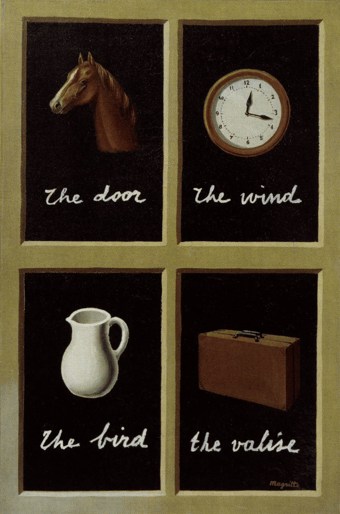
René Magritte, a Belgian painter, created a series of paintings in 1930–1935 called “The Key to Dreams”. In these paintings, words not matching the figures are written beneath them, as if designed to indicate the gap between word and object. The artist, juxtaposing specific objects with words naming other objects, exposes the inadequacy of words in describing objects.
According to Magritte’s philosophy, a traditional image and name of an object perform different functions. Here, I will not delve into how traditions work, but the point Magritte is trying to express and the issue I want to convey in this article converge on the same line. Magritte emphasises that there can be a vast difference between what we see, the meanings we attribute to them, and how we name them, but sometimes these may coincide.
Ways of Seeing
As John Berger mentions in “Ways of Seeing”, our thoughts and beliefs determine our perspective and perceptions. By stating that “perception and evaluation of an image depend on how we see it”, he underscores the subjective nature of seeing. Berger suggests that we should focus not on what the object we are focused on is, but on which elements catch our attention when we see it, and why these elements are important.
Berger expresses the difference between looking and seeing as follows: While looking is directing oneself outwardly to something, seeing is perceiving something from within. This situation defines seeing as a deeper understanding and perception process. Looking is just our eyes focusing on an object. However, seeing means understanding what an object is, what it means, and why it is there. In UI and UX design, for the user to see means that the design meets user needs and the ease of interaction with the product or service. Therefore, design principles are used to ensure users see rather than look.
UI and UX Design Principles
Based on Berger’s “Ways of Seeing” and Magritte’s philosophy, I can describe some principles applicable to UI and UX design as follows:
Give enough time to perceive: During the user’s interaction with the product, make sure to provide enough time for them to understand the visual data. For instance, loading an image may take a few seconds, so it’s important to provide an indicator informing users they need to wait this long.
Create a visual hierarchy: Highlight the critical information in your product by creating a visual hierarchy. The aim is to direct the user’s attention to the most important and prioritised elements of the product/design. For example, on a website, the size and placement of titles and subtitles can determine what the user should focus on.
Consider user habits: Conduct user research to understand how users behave and integrate this information into your design. For instance, we know that many users look for the main menu on the left side of the product, so you can take this information into account when designing the main menu.
Color, Contrast, and Typography: Visual elements like color, contrast, and typography are critical factors affecting the user experience. Color choice influences the user’s perception related to the product or service, contrast is used to attract the user’s attention and improve readability, and typography is vital in terms of user’s reading ease and comprehension
Simplicity and functionality: The design should be as simple as possible and serve the user’s purpose. For example, a mobile app should enable the user to complete a task quickly and easily.
Consistency of visual elements: Each element of the design should reflect the same brand message to the user and should be in the same style. For instance, the consistency of menus, buttons, and colours on a website can make it easier for users to navigate the site.
User feedback: Collecting user feedback and using this feedback in your design helps improve your product. You can use tools such as surveys or feedback boxes to get feedback from your users.
Visual arts help us reevaluate the world we see. This thought also holds a significant place in user interface and user experience design. As designers, we need to deeply consider how our users see, perceive, and understand our products. This not only ensures our design is functional and aesthetically pleasing but also allows us to meet the needs and expectations of our users. After all, the purpose of design is to enhance the user experience and make their world a little easier and more meaningful. Perhaps this is the deepest connection between art and design.
Related Articles