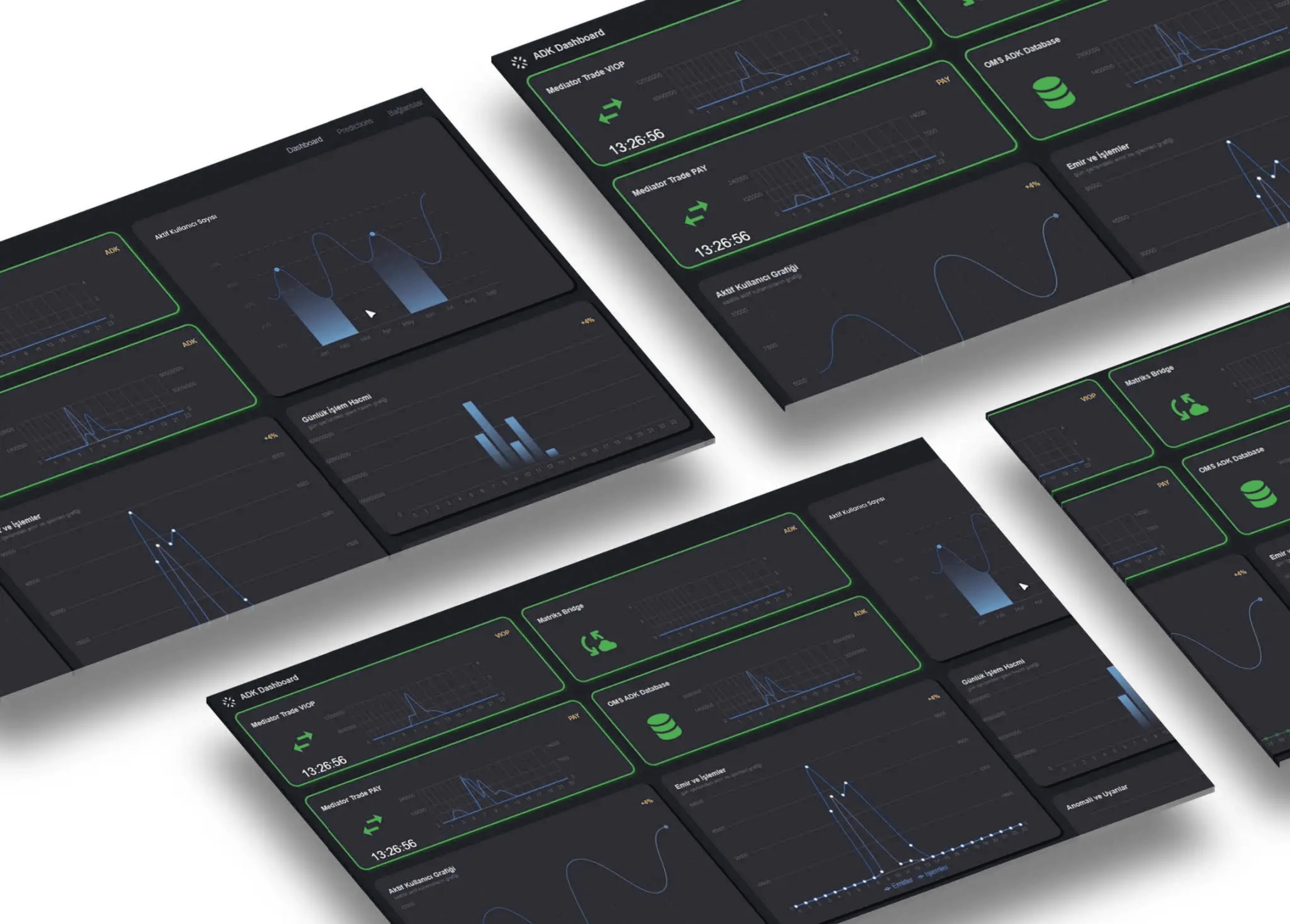
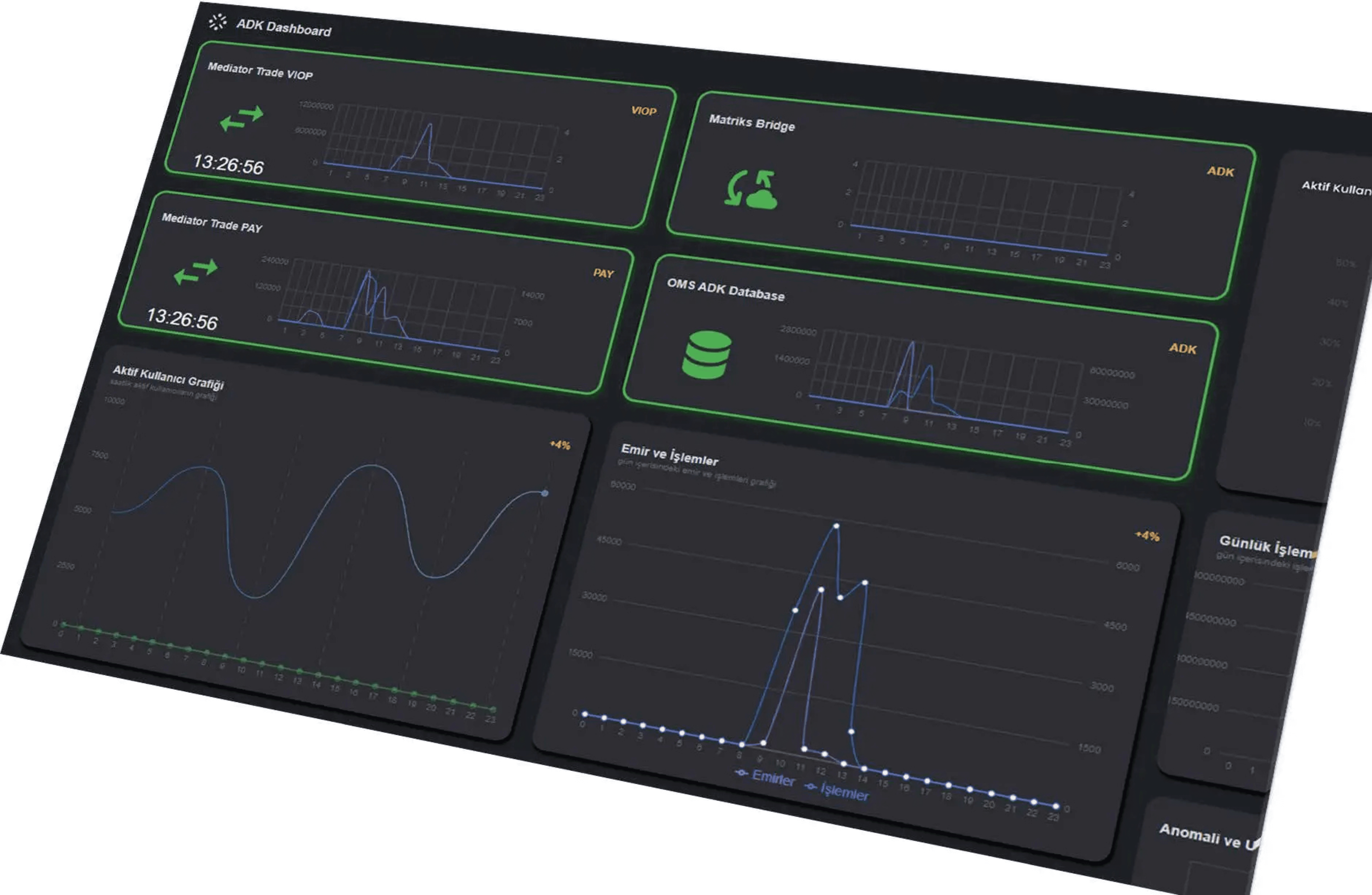
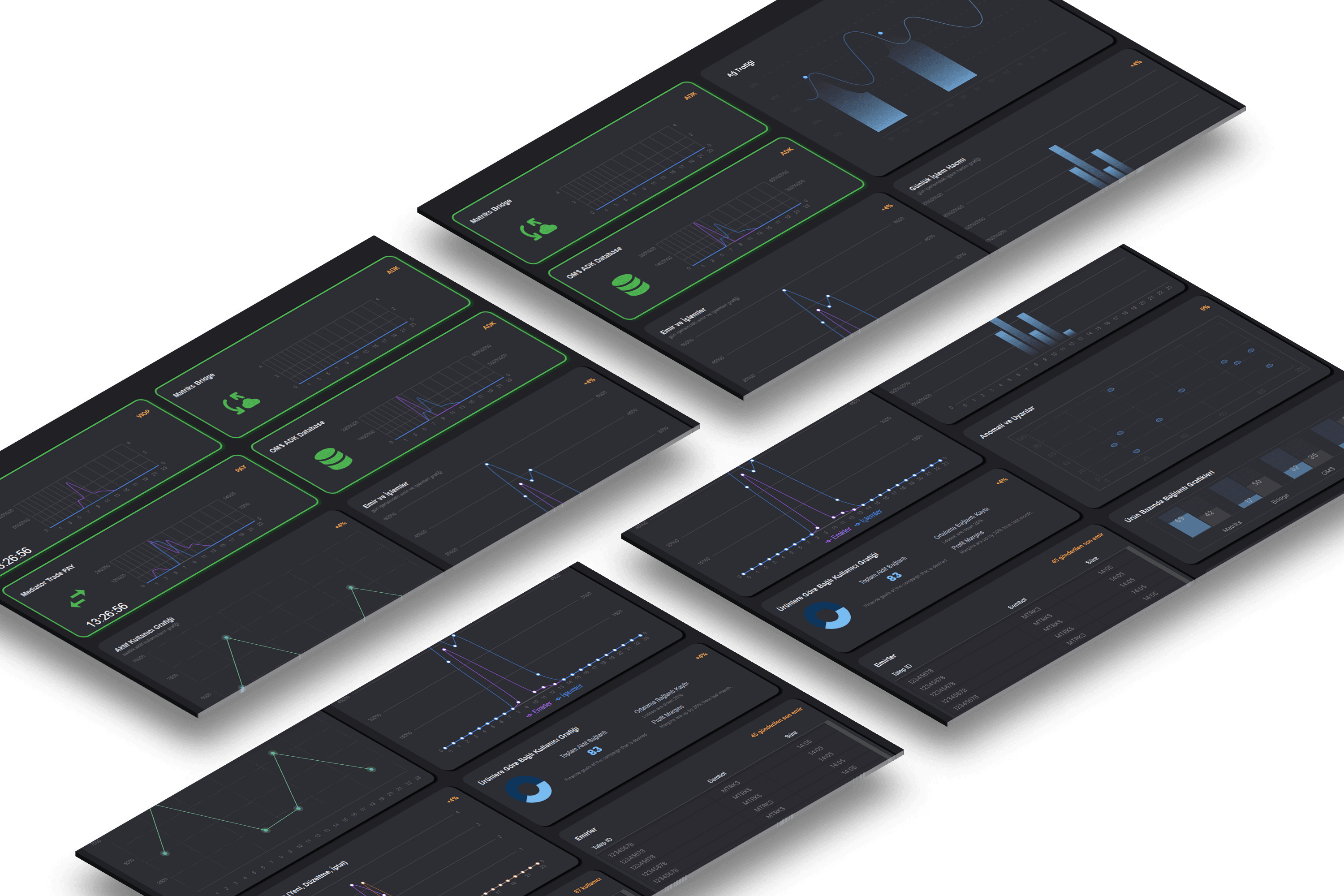
ADK – Real-Time System Monitoring Dashboard
ADK (Alternative Distribution Channel) dashboard acts as a bridge between servers and clients; collecting, reporting, and analyzing all user requests. Accessible via mobile, web, and desktop platforms, it also monitors the status of other connected services, delivering real-time updates and insights. The dashboard features user activity graphs, server status indicators, and a variety of reports and visualizations to keep users informed. It’s used by financial professionals to track system health, latency, user behavior, and data distribution pipelines via web, desktop, and mobile platforms.
Status
Live
Client
Matriks
Service
FinTech
Role
UX Designer & Front-End Developer
Tool

The Challenge
The legacy dashboard was:
Overloaded with data and visually dense
Lacking clear indicators and prioritization
Difficult to navigate, especially during peak market hours
These issues led to delays in action, user frustration, and missed system warnings — particularly under time pressure.
Objectives
Deliver real-time data updates with millisecond latency
Create a clear and customizable interface
Reduce cognitive overload for system-critical actions
Ensure visual and functional consistency across platforms
Target Users
Persona 1 – High-frequency trader
Needs: Immediate feedback, instant alerts, minimal UI noise
Persona 2 – Financial analyst
Needs: Visual trends, error tracking, multi-portfolio filtering
These personas helped shape the level of abstraction, chart density, and feedback timing within the interface.

Research & Discovery
Methods Used:
User interviews with traders and analysts
Workflow shadowing during peak trade hours
Infrastructure team feedback sessions
Socket-based simulation tests (WebSocket feed injections)
Key Insights:
Traders prioritize clarity and speed over deep configuration
Analysts prefer multi-layered dashboards with filters
Users often struggled to correlate alerts with system issues
Design Process
Workflow Mapping
Mapped real-time user journeys from login to monitoring, alerting, and issue resolution.
Prototyping
Designed interaction flows for drag-and-drop widgets, latency tracing, and error flags.
Cross-Platform Testing
Simulated usage across desktop, web, and mobile, including performance under live data feeds.
Design System Integration
Created modular UI components with consistent behaviors and accessible color contrasts.
Key UX Improvements
Real-Time Monitoring
Live charts showing latency, throughput, server status
Alert badges with severity indicators and hover breakdowns
Simplified Layout
Collapsible widget groups
Drag-and-drop dashboards with customizable views
Cross-Platform Design
Consistent UI across web, mobile, and desktop
Platform-specific tweaks for responsiveness and hierarchy
Feedback & Alerts
Toast messages for actions and system events
Alert filtering and resolution tracking
Results & Impact
Significant reduction in cognitive load during peak usage hours
Faster response times and fewer navigation errors
Higher user satisfaction scores from institutional clients
Enabled infrastructure teams to trace and resolve issues more efficiently
OMS is a professional trading system used by institutional investors in Borsa Istanbul’s bond market. The platform supports high-volume, fast-paced trading across eight financial sub-markets — including repo, reverse repo, and fixed-income instruments. Our goal was to redesign the platform to improve usability, reduce errors, and better support compliance requirements — all without disrupting real-time operations.